All Topics / General Property / Brisbane house price growth 1979-2011
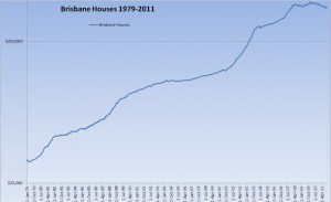
A log scale chart of Brisbane house price growth since 1979. Helps sometimes to take a step back and look at the larger picture.
Is the growth above the 250k line at the same scale as that below?
ummester wrote:Is the growth above the 250k line at the same scale as that below?
It's a log scale which is a better way of looking at compound growth as 10% growth on a 500k property is more than 10% growth on a 100k property in $ terms
Have you seen this?
http://www.youtube.com/view_play_list?p=6A1FD147A45EF50D
That said, I was under the impression most Ozzie property had grown by 3-5% PA (on average) from the 50s through to the 90s (give or take) and, after that time it took off and grew around 7-10% PA (on average) until 2005-2007 (state dependant). So, even on a log scale, wouldn't 7-10% growth show up as greater than 3-5% growth?
This graph (though a real index and not logarithmic) represents Ozzie property prices more as I have come to understand them.
I think a graph like this starts to get really interesting when you plot rental returns, wages and inflation against it aswell. Rental returns have basically dropped off as house prices have taken off, rent has increased a bit but not as much as prices. Inflation and wage growth have been more or less steady, though the seperation between upper wages and average incomes has widened significantly over the last 15 years. Oddly, the property rich in Austraiia are generally on average wages, which means the top earners are investing less in property than average earners making it likely that the very rich down under are getting so because of the debt average incomes are taking on.
I just read a bit more about log scales and they basically flatten exponential growth, right? So things that grow in multiples of themselves look steady but, when they drop, the drops look worse. I dare you to keep plotting a log scale of Brissy property until middle of 2012 and see how it looks.
ummester wrote:..
I just read a bit more about log scales and they basically flatten exponential growth, right? So things that grow in multiples of themselves look steady but, when they drop, the drops look worse. I dare you to keep plotting a log scale of Brissy property until middle of 2012 and see how it looks.No dare needed I have been doing this for many years and will continue to do so!
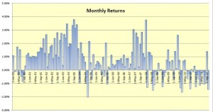
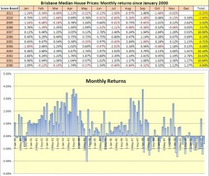
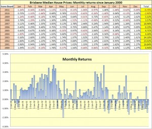
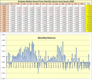
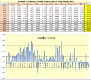
Introducing the Brisbane property score board! Data till 2000 at the moment, an interesting way to look at house price data and calendar year returns.
The Residex data extends back to the 70's and will update that when I have the opportunity.
Very cool, thanks for sharing


Cheers
Jamie
Jamie Moore | Pass Go Home Loans Pty Ltd
http://www.passgo.com.au
Email Me | Phone MeMortgage Broker assisting clients Australia wide Email: [email protected]
Data till end of November 2011.
The end of 2011 and the first few weeks of this year have been strong which is a great contrast to January 2011. Not clear if this will translate into a strong quarter but if it does that will be great as I personally know just how many people are sitting on the fence at the moment and waiting ( a lot). Some of the activity is due to the January 31st cut off date for the 10k boost for new product, though it seems like a large part of the activity can be attributed to the interest rate change of direction. Interesting to see if we can maintain this momentum!
Medians Nov 2011:
Houses: $429,341
Units: $352,961Andrew_A wrote:A log scale chart of Brisbane house price growth since 1979. Helps sometimes to take a step back and look at the larger picture.Very nice data put together, thanks for sharing.
Ever done CPI adjusted numbers? Would be interesting to see 'real' growth. It's hard to estimate the chart going back that far…Quote:Very nice data put together, thanks for sharing.
Ever done CPI adjusted numbers? Would be interesting to see 'real' growth. It's hard to estimate the chart going back that far…Yes I have done CPI adjusted charts in cases, not going far back as 79 though I do have CPI figures back to 1985 or so. It's an interesting task but time consuming, once you take one step you need to take others potentially such as adjusting for interest rates and so on!
Probably the 2nd chart in terms of importance I would suggest would be yields over time.
+1 on that one. Especially important now when yields starting to rise across Brisbane and it's time to start hunting.
Was it you I have spoken on the phone a month or two back? We discussed finding CF+ properties?
I got another one since then, two more on the list but could not get the price down low enough


The latest Brisbane property data current till the end of December 2011. Eleven out of twelve months recorded a capital loss in 2011 and only three of the last nineteen months have recorded gains. If you are looking to ‘buy the dip’ in Brisbane property there is a healthy chance that this might be the time!
With a capital loss of 6.7% for the calendar year 2011 it was most welcome to usher in 2012 and a chance for a stronger show! January 2012 has shown healthy turnover and renewed buyer interest so it will be interesting to see how well this reflects in the January data.
Houses: $427,253
Units: $352,9432012, Looks like being a good year! It might seem strange to get excited about a month that recorded a -0.03% capital loss until you understand what type of year 2011 was. I was predicting a flat January and my prediction has proven to be somewhat accurate. The increase in buyer activity was first noticed mid December and has continued right through January resulting in more healthy price action for our market.
There are still plenty of people sitting on the fence and watching the Brisbane market carefully, waiting for signs of positive momentum, fair enough, just keep in mind that if you are one of the people on this fence you need only glance around to see all of the people you will be competing against when the market turns. It’s really crowded on that fence presently.
Houses: $427,134
Units: $348,900
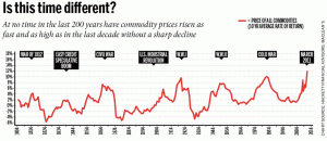
Source http://www.macrobusiness.com.au/2012/02/parko-meet-petard/Perhaps a far more interesting graph. Now tell me things will keep on booming!! I could produce dozens of graphs that give a far more realistic picture of macro and micro economic conditions than a flimsy speculative assessment of a snapshot in time regarding QLD markets.
If ever I saw someone clutching at straws!!
The Freckle
Yes perhaps a more interesting graph, how would we tell?
A snapshot in time of the QLD (Brisbane) market is a fair comment and that's all the data is showing, booming isn't the word I would use to describe our market over the last four years, no attempt to describe the larger economy or make any prediction apart from 2012 looking better than 2011. If you think you can do better than a buy and hold investor then prove it.
>>>Yes perhaps a more interesting graph, how would we tell?
I sometimes wonder if you are a sharp a tac as you make out. If you can’t get your head around the consequences of the supplied graph then you can’t be taken seriously. Do you think property operates in isolation to the rest of the economy?
>>>A snapshot in time of the QLD (Brisbane) market is a fair comment and that’s all the data is showing,
That’s all the data shows but you have somehow extrapolated declining trend -2.9% (2010) -6.7% (2011) for a total nose dive of 9.6% in 24 months and then somehow come to the conclusion that 2012 looks better. I’ve seen subjective analysis before but this one absolutely takes the cake.
>>>booming isn’t the word I would use to describe our market over the last four years,
Then why start a thread with a graph that runs at 45 deg if you don’t mean to imply something extra ordinary.
As a realestate agent I wouldn’t trust your analysis one iota. It just doesn’t jive with reality. You come across as just another property spruiker hyping a flagging market.
The Freckle
It's just Residex data, including the log graph at the beginning that you describe as your 45 degrees. Interpretations based on the data that I seem to be making according to you are definitely open to debate.
2012 is looking better as buyer activity has been strong since mid December and turnover should definitely reveal higher numbers. Yes this is subjective as 2012 hasn't finished yet! We will see what happens with the data, I expect Feb will print close to flat as well for Brisbane, we will see in a few weeks.
The freckle, since my answer about 'prove it' could have been taken as flippant I apologize, will expand on the point about the graph you posted.
Also re: Real Estate agent comment, hardly a difficult qualification to achieve, I would upgrade my status to 'internet stranger' for purposes of internet debate, I was an anonymous internet commentator long before getting an agents license. Re: Spruiking, well my vested interest is that people buy property and use my services, above that not a great concern what happens to the market other than I'm also an investor and prices grinding lower hurts confidence, crash probably not good for almost everyone, flat to moderate growth can live with comfortably, boom also not good perhaps. My vested interest in property should be obvious.
Re: Your chart. No I don't think property operates in isolation, it's tied very closely to the economy. Issues such as credit supply and debt are very important, I'm no expert on that at all. Specifically in terms of commodity prices, I don't know what interpretation you have of that graph? To me it's just a graph showing record high prices are at the moment, what does that all mean?
My take would be presumably some reversion to the mean at some point and we can expect sharply lower prices? Might expect lower prices but there would also be some chance of structural change to the mean as we are talking about non renewable resources with a growing world population but that's just a guess. What would that imply for property prices specifically if commodity prices fell? What has it done in the past? what's the correlation between commodity prices and property?
I believe it's fair to assume property will continue to grow in line with the growth of our country, perhaps at or around inflation, perhaps at lower rates than in the past, this is roughly in line with Residex predictions for 5 year forward growth, we all have to base our investing decisions on something and that's what I'm doing. If you were to have a view that property won't grow or fall in price you would naturally make very different decisions.
Latest data from Residex for Brisbane. The grind lower continues but I think what we are seeing is different to 2011 at the moment, Louis Christopher from SQM has explained why this might be so, increased activity taking property out at lower levels rather than sellers withdrawing listings being the gist.. Anyway time till tell, looks like a good 2012 so far, investors are back in more healthy numbers.
Houses: $427,134
Units: $348,900
You must be logged in to reply to this topic. If you don't have an account, you can register here.


